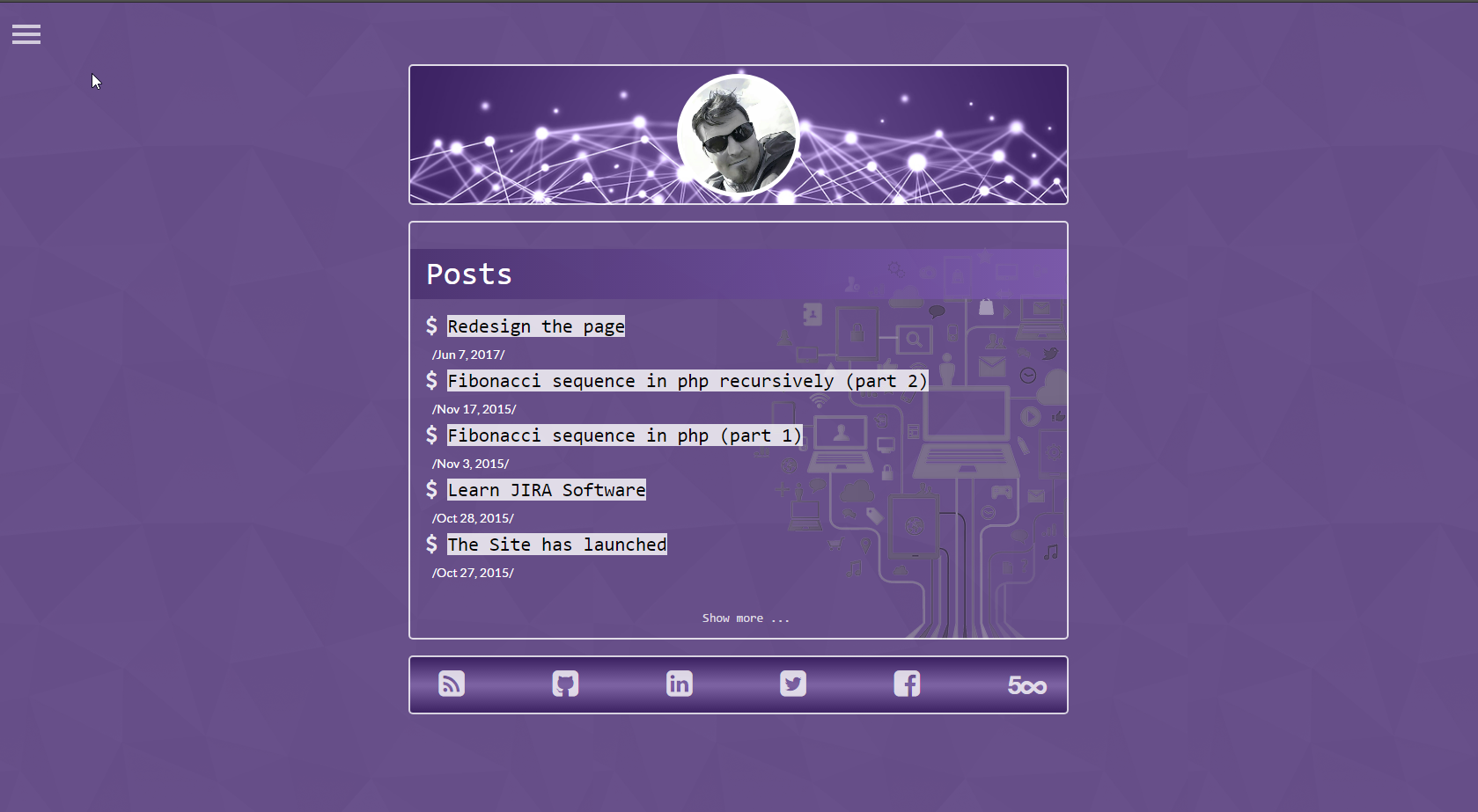
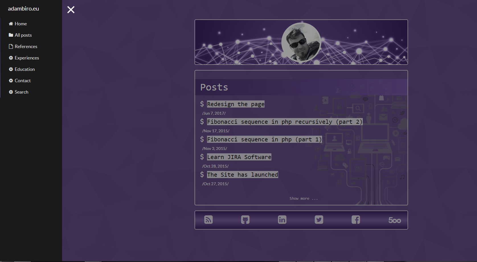
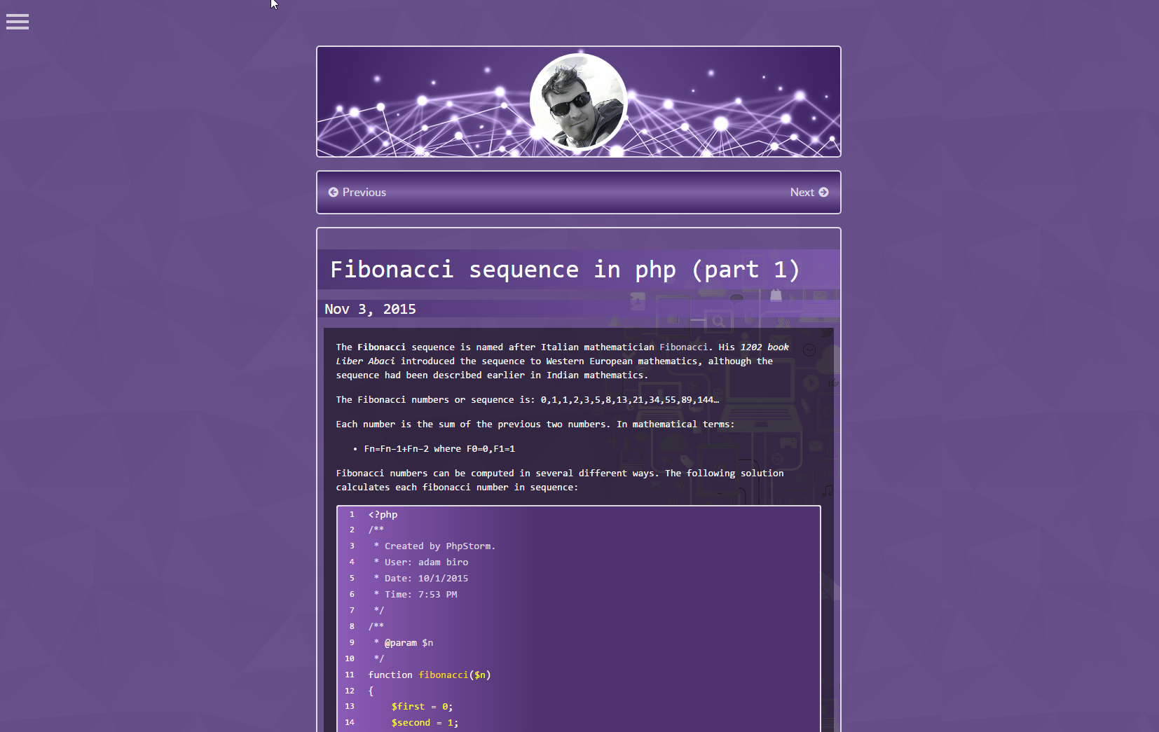
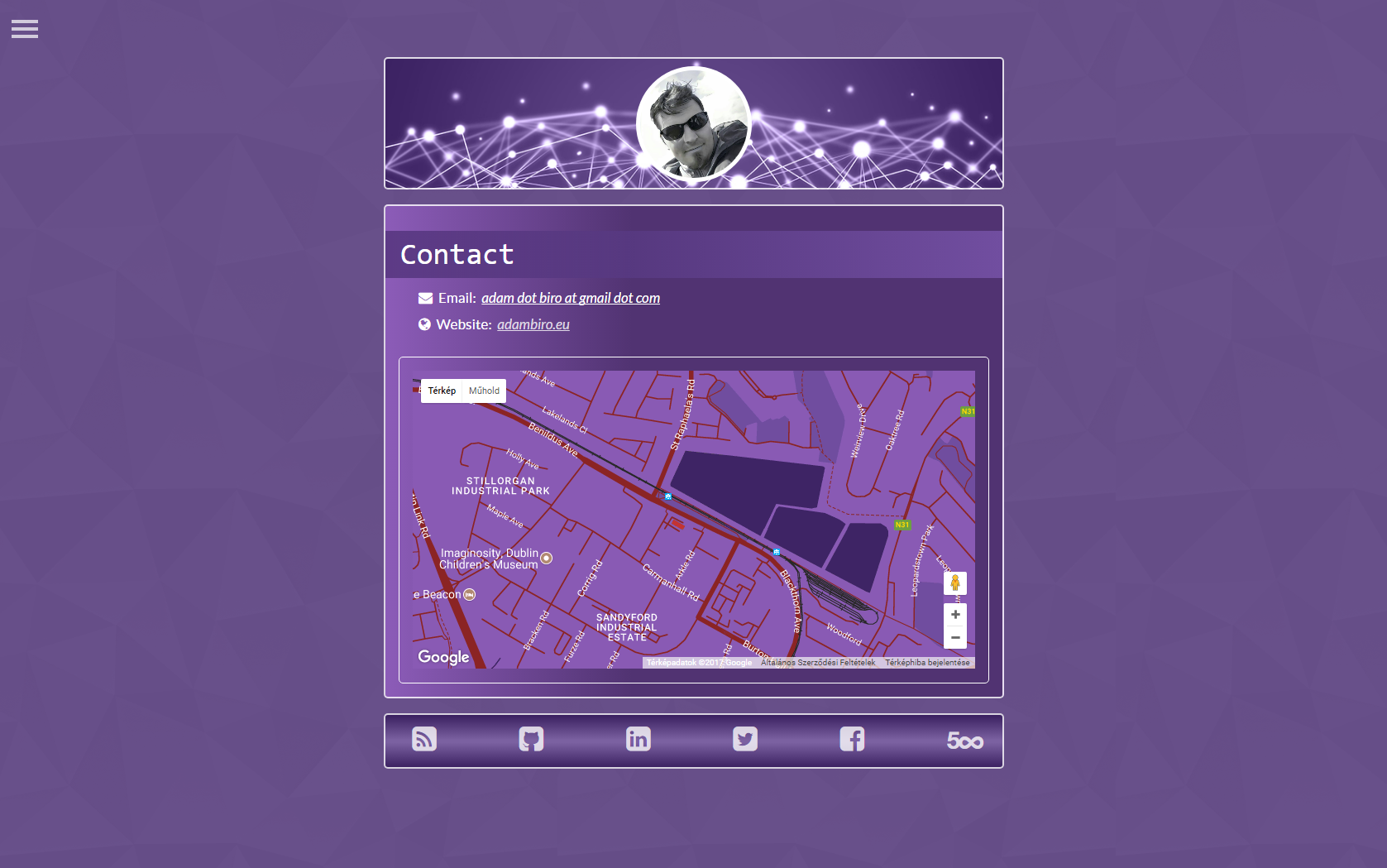
After a long time, I had a chance to redesign the original template which I had chosen. I wanted a refreshing style instead of a dark one. I am not saying I don't like the dark colors and shades, but I thought it was high time to make some changes to the current layout. While the previous look out based on Jacob Tomlinson's template the current one is my implementation. I know it could be much better, but I would like to highlight that I am not a designer :).
comments powered by Disqus


